I love typography and everything it entails. It’s pretty telling that my favorite book is The Elements of Typographic Style by Robert Bringhurst. It was assigned as mandatory reading in one of my classes from college, and I still have it around because it is such a great resource for all things typography. I’m such a nerd that sometimes I flip through it FOR FUN.
Now, I went to school to learn this, but I’d like to share my expensive art-school knowledge with y’all. I think there are a few terms and theories that anyone should know about typography. People who use Word on a regular basis won’t necessarily be familiar with them, but those of you that use any Adobe Creative Suite program might already have an idea:
1. Fonts: Weights & Families
2. Letter-spacing (aka, kerning)
3. Line spacing (aka leading, pronounced like the stuff in pencils…lead)
Font Weights and Font Families
You might already have guessed, but font weight has to do with the style of the letter. You are probably familiar with how to make something BOLD or italic, but it’s a little more than that. When a type designer designs his or her font, they design different weights by adding thickness, removing thickness and even italicizing the font to create a family. Just how there are thin and heavy folks in everyone’s family, there are thin and heavy versions of fonts in font families. The designer takes the time to make sure the font stays true to its look in all potential forms.
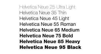
In my opinion, when you bold or italicize a font using a word processing software, it’s bastardizing the font. The software has a built in function that just adds thickness arbitrarily and for italics, squishes and slants the font. You should instead be choosing the Heavy version, or the Italic version in the font’s family. For example, Helvetica, one of the most prolific fonts from the International Typographic Style period of graphic design, has many weights, as shown below.

So, in this case, instead of just pressing the B for bold, choose the “Bold” or “Heavy” version of Helvetica instead. Trust me, your document will shine because of it.
Letter-spacing/Kerning
Letter-spacing is probably one of the most important typographic functions when it comes to designing, especially when the copy will be large (on billboards, posters, etc.). Letter-spacing, also known to most designers/typographers as kerning, is adjusting the space between letters in a typeface. Type Designers typically install a set amount of space around each letter, harkening back to the days when each letter was created out of metal blocks and letter-spacing was determined by the size of the block for that letter (see below). Oftentimes, letters that had large widths would be shaved down, leaving the edges of the letter free, so it could overlap on the letter block next to it.

Now that we are in the digital age, kerning isn’t as difficult. My favorite thing to do when designing a logo or branding of a company is picking out the typeface(s), and spending an hour or so kerning the letters perfectly in Illustrator. Taking the time to kern during this step ensures that at no matter what size, the logotype stands up. Bonus kerning fact: you can also work with ligatures (where two letters are joined into a glyph) which some designers design as apart of their typical alphabet. You’ll find these glyphs on some of the older, more professional fonts such as Caslon, Goudy, and Garamond.

You’ve probably seen some logos out there with interesting kerning/ligatures, such as the FedEx logo (subliminal arrow between the e and x), and if you like hot sauce, Frank’s Red Hot (the d and H are connected). It can make for some interesting logotypes, to say the least.
Line-spacing / Leading
The space between lines is what’s known as leading and when it comes to readability, nothing beats a healthy dose of it, especially in web design. This is often overlooked, but can really make a design look polished when it is taken into consideration. The terminology of this also harkens back to days when printers put strips of lead (or other soft metal) between the letter blocks that made lines to create vertical space.
Word processing software also bastardizes this process by only giving you the option of single or double spacing (whoa, college essay writing flashback…). From my favorite book:
“Space in typography is like time in music. It is infinitely divisible, but a few proportional intervals can be much more useful than a limitless choice of arbitrary quantities.”
Leading is communicated by what looks like a fraction: 11/21. This is translated as 11pt font size over 21pt of line spacing. This means that there is 21pts between the baseline of the top line to the baseline of the second line. Typically in print, you’ll see spacing just about double the font size (11/21). This, however, does not mean “double-spacing”. What you see as double spacing in Word is probably closer to triple spacing, based on the size of the font.
That’s the lesson for today! I hope that helped you have a little better understanding of typography. More to come!
